Analyzing The Office’s dialogues
I stumbled across an R package named ‘schrute’ that is basically a dataset with all the dialogues in The Office, one of my favourite TV series. So I thought: let’s give it a try!
You can find the R code by expanding where it says so: I’ve tried to comment most of it, but you’ll find something without comment. If you have any doubt or you’re just curious about that specific chunk, feel free to contact me!
You can click on any plot to see it in high quality
Click to see which libraries I’ve used, some basic operations with the `tidytext` package and some minor quirks to the `theme` function.
#install.packages("schrute")
library(tidyverse)
library(schrute)
library(tidytext)
library(showtext)
library(ggtext)
library(lemon)
library(ggsci)

font_add_google("Special Elite", "specialelite")
showtext_auto()

# Downloading the dataset
dialogs_raw <- schrute::theoffice

# Let's transform the dataset, by unnesting: now one row is one word. We have 570450 rows!
dialogs_words <- dialogs_raw %>%
  tidytext::unnest_tokens(word, text)

# Remove stop words (common words, not useful for analysis): we have left 169835 rows(= words)
dialogs_words <- dialogs_words %>%
  anti_join(stop_words, by = "word")

# Removing some non-useful words or characters
blacklist <- c("yeah", "hey", "uh", "gonna", "um")
blacklist_characters <- c("Everyone", "All", "Both", "Guy", "Girl", "Group")
dialogs_words <- dialogs_words %>%
  filter(!word %in% blacklist,
         !character %in% blacklist_characters)
# Setting the theme for the plots. I have also updated the theme with some settings, but they're just a copy of what I did in the various plots. Normally you set theme here, and leave the 'theme' function of each plot cleaner, but anyway...
theme_set(theme_minimal(base_family = "specialelite"))

theme_update(
  panel.grid.major.y = element_blank(),
  panel.grid.minor.y = element_blank(),
  plot.background = element_rect(fill = "#fafaf5", color = "#fafaf5"),
  strip.text = element_text(size = rel(2), face = "italic"),
  panel.spacing = unit(1.5, "lines"),
  plot.margin = margin(10, 25, 10, 25),
  plot.title = element_text(hjust = .5, size = rel(3)),
  plot.subtitle = element_text(hjust = .5, size = rel(1.5)))
Who speaks the most?
Let’s start with some easy stuff: how are the lines distributed between major characters and seasons?
Click to see the code
# We're working with dialogs_raw just because we want to analyze lines and not single words

# Let's save in a vector the top 20 character that say most lines overall during the series
top_20_character <- dialogs_raw %>%
  count(character, sort = T) %>% head(20) %>%
  pull(character)

# Now we can calculate the % (probably there are some useless lines here, but I left them just because you can see how my mind works while coding lol)
percent_season <- dialogs_raw %>%
  group_by(season, character) %>%
  count(text) %>%
  ungroup() %>%
  arrange(season, desc(n)) %>%
  group_by(season) %>%
  mutate(percent = n / sum(n)) %>%
  ungroup() %>%
  group_by(season, character) %>%
  summarise(percent_season = sum(percent)) %>%
  arrange(season, desc(percent_season)) %>%
  filter(character %in% top_20_character) %>%
  arrange(desc(percent_season)) %>%
  mutate(character = factor(character, ordered = T, levels = top_20_character))

# let's plot
plot_percent_season <- percent_season %>% ggplot(aes(season, percent_season)) +
  geom_area(fill = "burlywood3") +
  facet_rep_wrap(~ character, repeat.tick.labels = T) + # probably this repeat.tick.labels is useless, I should check
  scale_x_continuous(breaks = seq(1:9), expand = c(0.01, 0.01)) + # the expand function is the most useful thing there is in R, change my mind (it basically deletes all white space near the axis)
  scale_y_continuous(labels = scales::percent_format(), expand = c(0.01, 0.01)) +
  theme(axis.title.y = element_blank(),
        panel.grid.minor = element_blank(),
        panel.grid.major = element_line(linetype = "dotted"),
        panel.spacing = unit(1.5, "lines"), # just to give some space to each facet
        strip.text = element_text(size = rel(1.7)),
        axis.title.x = element_text(size = rel(1.3), margin = margin (t = 10)),
        plot.title = element_text(hjust = .5, size = rel(3)),
        plot.subtitle = element_text(hjust = .5, size = rel(1.5))) +
  labs(x = "Season",
       caption = "Inspired by The Pudding • Data from the R package 'schrute'",
       title = "Who speaks the most in The Office?",
       subtitle = "% of lines per season for the top 20 characters that speaks the most")


#this way of saving is copied from Cédric Sherer's code lol (check him out!)
ggsave(here::here("plots", "Most_lines_per_season.pdf"), width = 15, height = 9, device = cairo_pdf)

path <- here::here("plots", "Most_lines_per_season")
pdftools::pdf_convert(pdf = glue::glue("{path}.pdf"),
                      filenames = glue::glue("{path}.png"),
                      format = "png", dpi = 250)
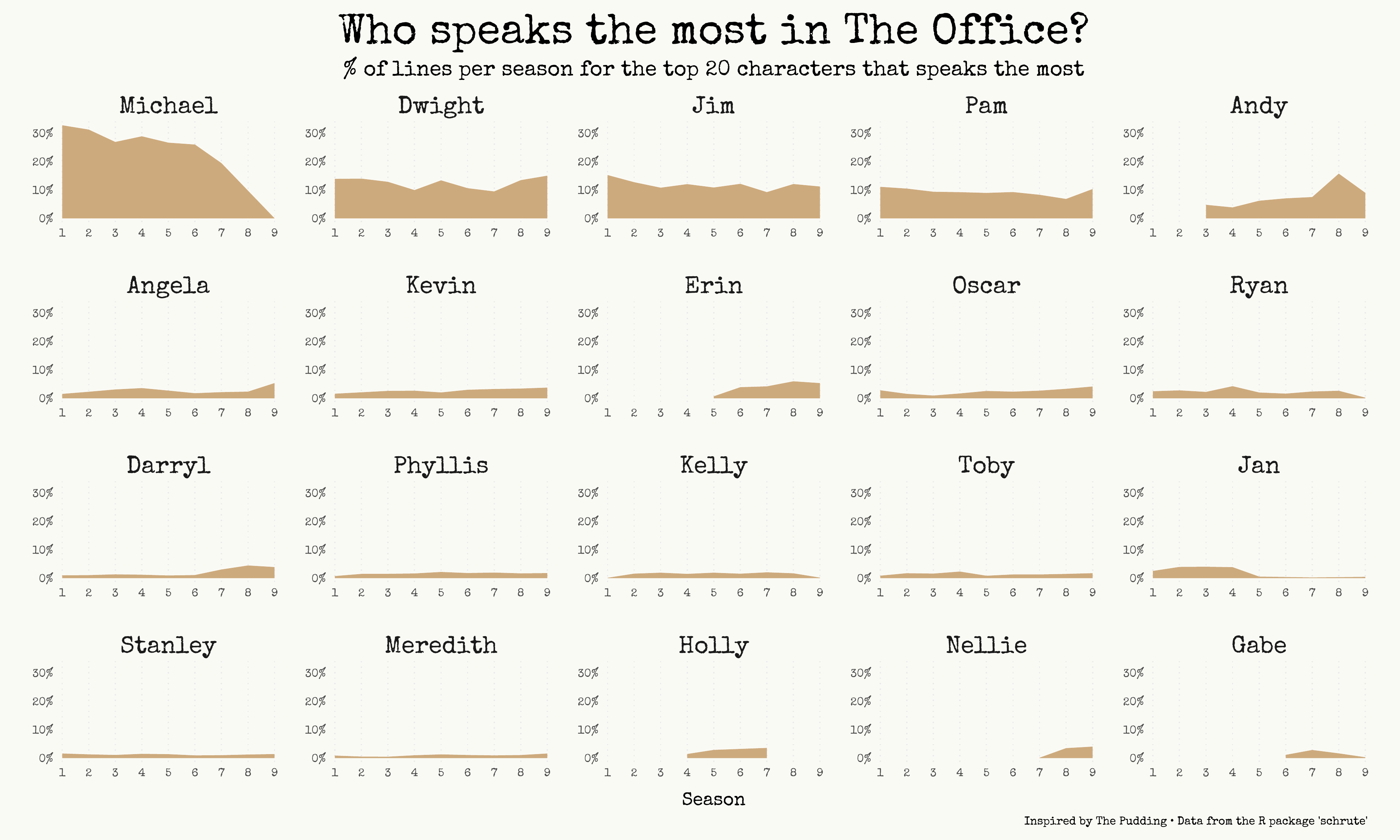
Ok, as you’ve probably guessed if you’re a fan of the series, Michael speaks a lot. Almost 1 line every 3 is said by the World’s best boss (😉). Andy is the character with most lines in season 8, which is reasonable since he becomes the regional manager.
And yes, I know that an area chart is misleading here: by looking at the chart it seems that in season 8 Michael says about 10/12% of the total lines, but in reality that number is 0% (season 8 is the only one where Michael is not there).
Most popular words for each season
Another easy question: which are the most said words? Let’s facet (= showing small multiplies charts) them by season, just to add some context. Probably they’re going to be just names, but maybe we’re going to have some surprise!
Click to see the code.
words_season <- dialogs_words %>%
  group_by(season) %>%
  count(word) %>%
  top_n(10, n) %>%
  mutate(word = reorder_within(word, n, season),
         label = glue::glue(" Season {season} ")) # glue is very similar to paste0

words_season %>% ggplot(aes(word, n, fill = label)) +
  geom_col() +
  coord_flip() +
  facet_wrap(~ label, scales = "free") +
  scale_x_reordered(expand = c(0.01, 0.01)) +
  scale_y_continuous(expand = c(0.01, 0.01)) +
  theme(axis.text = element_text(family = "Roboto Condensed"),
        legend.position = "none",
        panel.grid.minor = element_blank(),
        strip.text = element_text(size = rel(1.7)),
        panel.spacing = unit(1.5, "lines"),
        plot.title = element_text(hjust = .5, size = rel (2.5)),
        plot.margin = margin(10, 25, 10, 25)) +
  scico::scale_fill_scico_d(palette = "brocO") + # I really think that this palette is perfect for The Office. Anyway, just love for the scico package and palettes
  labs(y = "# of times",
       x = "",
       caption = "Data from the R package 'schrute'",
       title = "The most cited words in The Office", )

ggsave(here::here("plots", "Most_cited_words.pdf"), width = 15, height = 9, device = cairo_pdf)

path <- here::here("plots", "Most_cited_words")
pdftools::pdf_convert(pdf = glue::glue("{path}.pdf"),
                      filenames = glue::glue("{path}.png"),
                      format = "png", dpi = 450)
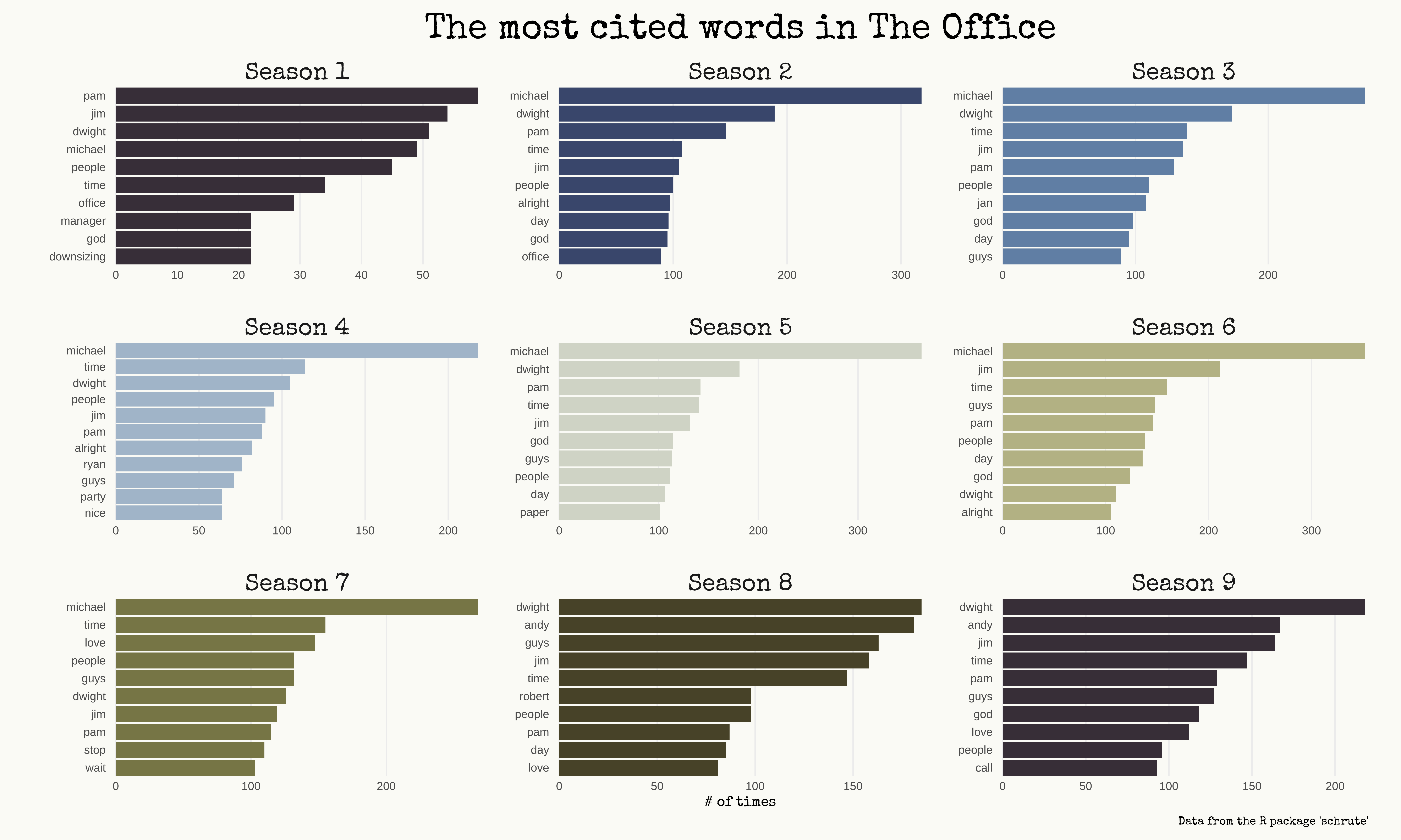
Names everywhere, as I said! Anyway, we can find some nice stuff: in season 1 the 10th most said word is downsizing, which is a recurring theme; there’s paper in season 5, love in season 7 (you know why, don’t you?), and Robert in season 8 (hey Robert California!).
TF-IDF - Most unique words!
How do I describe what tf-idf means? I’ll use Andrew Heiss’ words:
We can determine which words are the most unique for each book/document in our corpus using by calculating the tf-idf (term frequency-inverse document frequency) score for each term. The tf-idf is the product of the term frequency and the inverse document frequency
Basically it’s a value that shows - in this case - how unique is a word said by a character, relating to the other characters. Just look at the chart and you’ll understand.
Click to see the code.
character_tf_idf <- dialogs_words %>%
  add_count(word) %>%
  filter(n >= 20) %>%
  count(word, character) %>%
  bind_tf_idf(word, character, n) %>% # check the tidytext package to learn what this function does
  arrange(desc(tf_idf))

# a kind of a mess, but this is how I work! 100% natural code lol
character_tf_idf %>%
  filter(character %in% c("Dwight", "Jim", "Michael", "Andy", "Pam", "Holly", "Ryan", "Kevin")) %>%
  group_by(character) %>%
  top_n(10, tf_idf) %>%
  ungroup() %>%
  mutate(word = reorder_within(word, tf_idf, character)) %>%
  ggplot(aes(word, tf_idf, fill = character)) +
  geom_col() +
  coord_flip() +
  scale_x_reordered() + # this goes together with 'reorder_within': basically it reorders INSIDE each facet
  facet_wrap(~ factor(character, levels = c("Dwight", "Jim", "Michael", "Andy", "Pam", "Holly", "Ryan", "Kevin")), scales = "free", ncol = 4) +
  labs(x = "",
       title = "The most unique words by top character in The Office",
       subtitle = "tf-idf is a way to calculate the most unique words to each character",
       caption = "Data from the R package 'schrute'") +
  scico::scale_fill_scico_d(palette = "brocO") +
  theme(legend.position = "none",
        plot.subtitle = element_text(hjust = 0, color = "gray50", size = rel(1)))

ggsave(here::here("plots", "tf_idf.pdf"), width = 15, height = 9, device = cairo_pdf)

path <- here::here("plots", "tf_idf")
pdftools::pdf_convert(pdf = glue::glue("{path}.pdf"),
                      filenames = glue::glue("{path}.png"),
                      format = "png", dpi = 250)
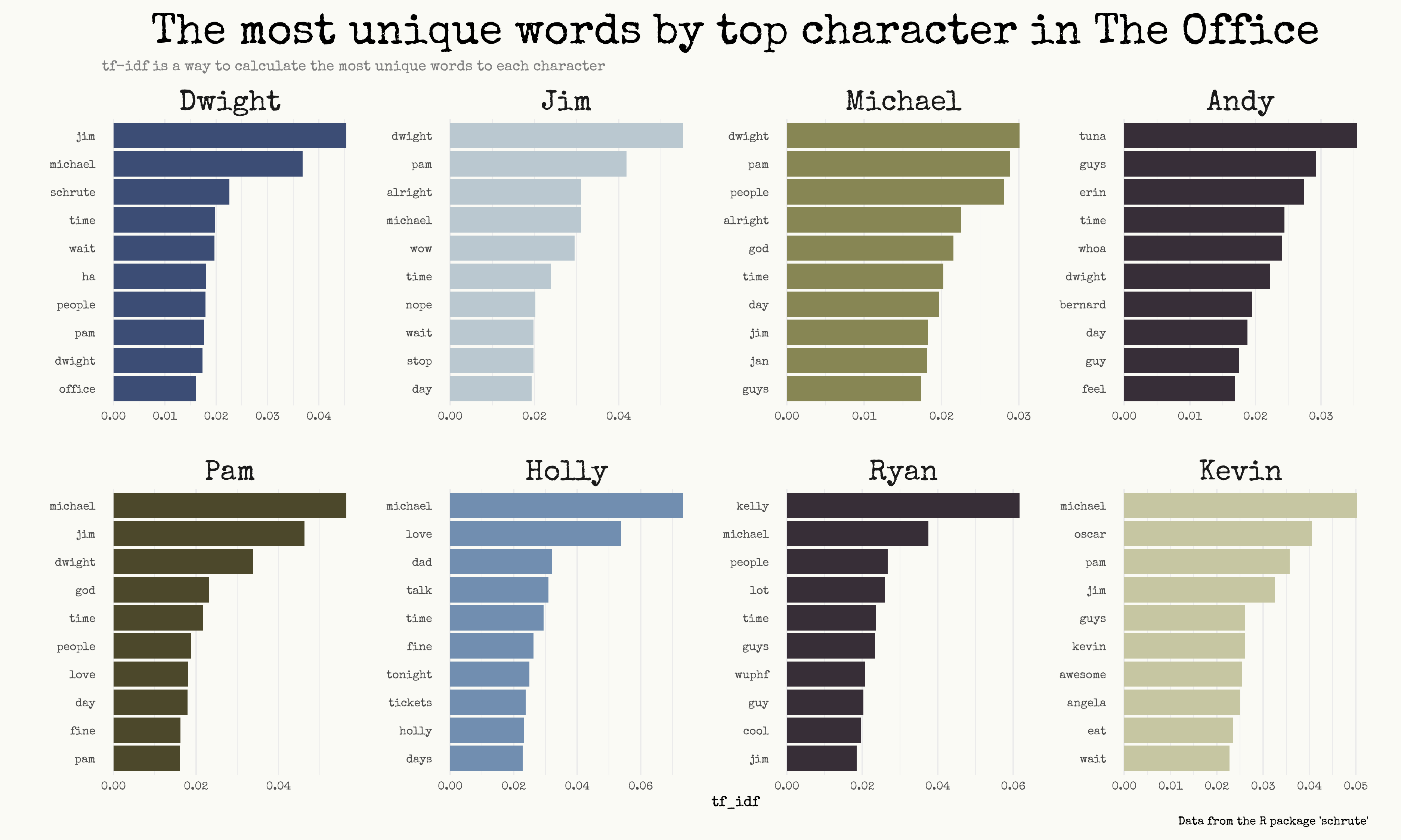
Obviously, the tf-idf doesn’t mean that a word is exclusive to that character. Instead, it’s useful to see which are the most strange words: take for example Ryan and you’ll find wuphf, or awesome by Kevin. The third most unique word said by Dwight is schrute, lol.
Sentiment analysis
And now, let’s do some sentiment analysis. I’ve decided to recreate a plot made by The Pudding, with some little adjustments.
The goal is to look for the positivity and negativity of words said by the top 20 characters.
Click to see the code.
# get_sentiments("nrc") # range of emotions
# get_sentiments("bing") # negative and positive

office_sentiments <- dialogs_words %>%
  inner_join(get_sentiments("bing")) # get the sentiment for every word in the dataset


# now we calculate the sentiment for each character (by season, and the average)
office_sentiments <- office_sentiments %>%
  filter(character %in% top_20_character) %>%
  group_by(season, character) %>%
  count(sentiment, sort = T) %>%
  filter(n > 10) %>%
  arrange(season) %>%
  pivot_wider(names_from = "sentiment", values_from = "n") %>%
  mutate(ratio = positive / negative) %>%
  group_by(character) %>%
  mutate(mean = mean(ratio, na.rm = T))

# My first idea was to use this as a vline in the plot, but then I've changed my mind and place a vline on 1 (= equally balanced between positive and negative words)
office_avg <- office_sentiments %>%
  ungroup() %>%
  summarise(avg = mean(mean, na.rm = T)) %>%
  pull(avg)


office_sentiments %>%
  ggplot(aes(x = ratio, y = fct_reorder(character, -mean), color = as.factor(season))) +
  geom_point(alpha = .35, size = 4) +
  scale_color_uchicago() +
  scale_fill_viridis_c() +
  theme(legend.position = "none",
        axis.text.x = element_blank(),
        panel.grid = element_blank(),
        plot.title = element_text(margin = margin(t = 15)),
        plot.subtitle = element_text(family = "Roboto mono", margin = margin(t = 10, b = 10), hjust = 0),
        axis.text.y = element_text(size = rel(1.5))) +
  geom_vline(aes(xintercept = 1), color = "gray70", size = 0.6, style = "dotted") +
  geom_segment(aes(y = character, yend = character, x = mean, xend = 1), size = .8, alpha = .8) +
  geom_point(aes(x = mean, y = character, fill = mean), shape = 21, size = 6, alpha = .8) +
  labs(x = "",
       y = "",
       caption = "Data from the R package 'schrute'",
       title = "The most positive and negative characters in The Office",
       subtitle = "The sentiment of main characters each season according to Bing Liu's lexicon") +
  annotate(geom = "segment", x = 1.35, xend = 1.55, y = 15.5, yend = 15.5, arrow = arrow(angle = 15, length = unit(0.5, "lines")), color = "#2ECC40") +
  annotate(geom = "text", label = "More positive character", x = 1.45, y = 15, size = rel(4.5), color = "#2ECC40") +
  annotate(geom = "segment", y = 19.5, yend = 19.5, x = 1.2, xend = 1, arrow = arrow(angle = 15, length = unit(0.5, "lines")), color = "gray50") +
  annotate(geom = "text", label = "Neutral (equally positive and negative)", x = 1.05, y = 19, hjust = 0, size = rel(4.5), color = "gray50")

ggsave(here::here("plots", "Sentiment.pdf"), width = 15, height = 9, device = cairo_pdf)

path <- here::here("plots", "Sentiment")
pdftools::pdf_convert(pdf = glue::glue("{path}.pdf"),
                      filenames = glue::glue("{path}.png"),
                      format = "png", dpi = 250)
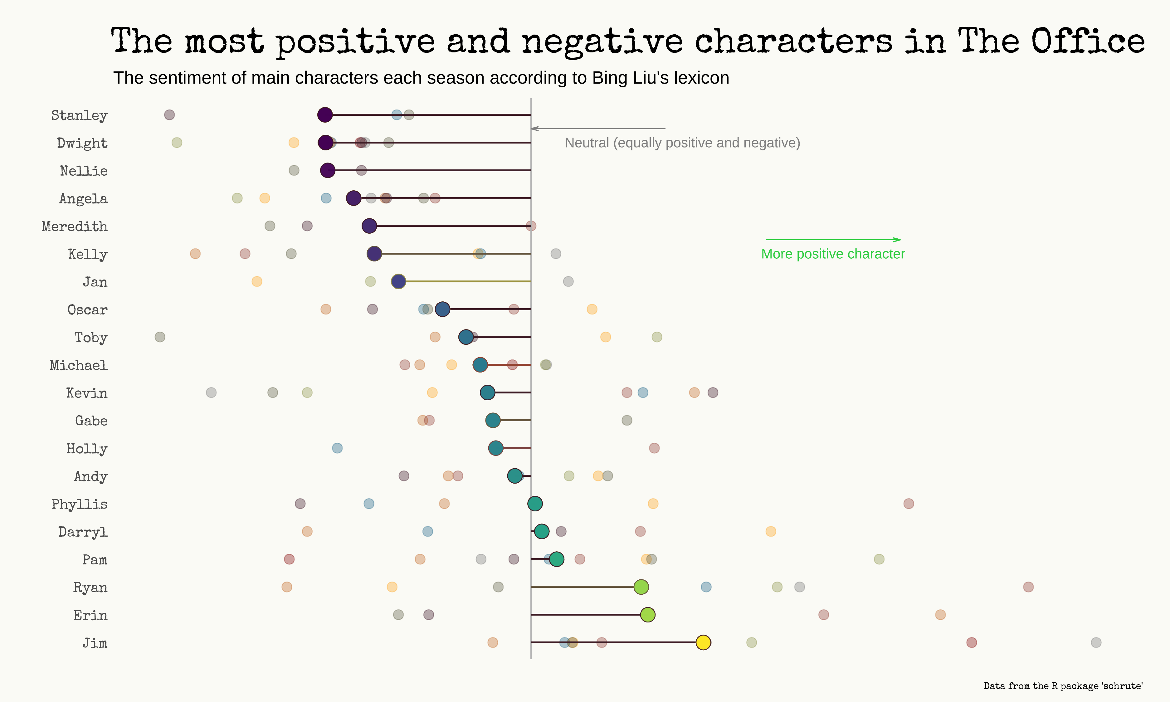
Ha! Before looking at this, I would have probably said that Erin was the most positive character. She’s second, behind Jim! Stanley is the most negative, probably because he said a lot of times that he just doesn’t want to work 😅.
I’m actually surprised to see that Dwight is the 2nd most negative character, but this is explainable via the sentiment-dictionary that I used (Bing Liu’s lexicon). The Pudding - which used IBM’s Watson - had largely different results (for them Andy is the most positive character).
That’s what she said
And now, the highlight of this blog post.
Talking with my girlfriend about this dataset, she asked me: “can you visualize somehow every time they say ‘That’s what she said’?”. I had to figure out how.
I’ve decided to make a strip plot with some jitter (randomness) applied to avoid overlapping.
As always, click to see the code.
thats_what_she_said <- dialogs_raw %>%
  filter(str_detect(text, regex("That's what she said", ignore_case = T))) #the ignore case is there because without it I got 26 lines, ignoring the 7 lines where 'that's what she said' was written in caps lock or in some strange way

thats_what_she_said <- dialogs_raw %>%
  select(index, season, episode, character, text) %>%
  mutate(phrase = ifelse(str_detect(text, regex("That's what she said", ignore_case = T)), T, F),
         label = glue::glue(" Season {season} "))

thats_what_she_said %>%
  ggplot(aes(episode, 1)) +
  geom_point(color = "grey10", alpha = .05, position = position_jitter(seed = 2021, width = 1)) + #seed is there to have always the same randomness
  geom_point(data = filter(thats_what_she_said, phrase == T), aes(episode, 1), shape = 21, fill = "red", color = "white", position = position_jitter(seed = 2021, width = 0, height = .2), size = 3) +
  facet_wrap(~ label, scales = "free") +
  scale_x_continuous(expand = c(0.01, 0.01)) + # I love you expand feature, I really do
  scale_y_continuous(expand = c(0.01, 0.01)) +
  labs(x = "Episode",
       y = "",
       title = "Every <span style='color: red'>'That's what she said'</span> in The Office",
       subtitle = "Every point is a line said by one character.The y axis is just jitter.",
       caption = "Data from the R package 'schrute'") +
  theme(axis.ticks.y = element_blank(),
        axis.text.y = element_blank(),
        plot.title = element_markdown(hjust = .5, size = rel(3)),
        plot.title.position = 'panel',
        plot.subtitle = element_text(size = rel(1), color = "gray50", hjust = 0),
        axis.title.x = element_text(margin = margin(t = 10)),
        plot.caption = element_text(color = "gray50"),
        panel.grid.major.y = element_blank(),
        panel.grid.minor.y = element_blank(),
        plot.background = element_rect(fill = "#fafaf5", color = "#fafaf5"),
        strip.text = element_text(size = rel(2), face = "italic"),
        plot.margin = margin(10, 25, 10, 25))


ggsave(here::here("plots", "That's what she said.pdf"), width = 15, height = 9, device = cairo_pdf)

path <- here::here("plots", "That's what she said")
pdftools::pdf_convert(pdf = glue::glue("{path}.pdf"),
                      filenames = glue::glue("{path}.png"),
                      format = "png", dpi = 200)
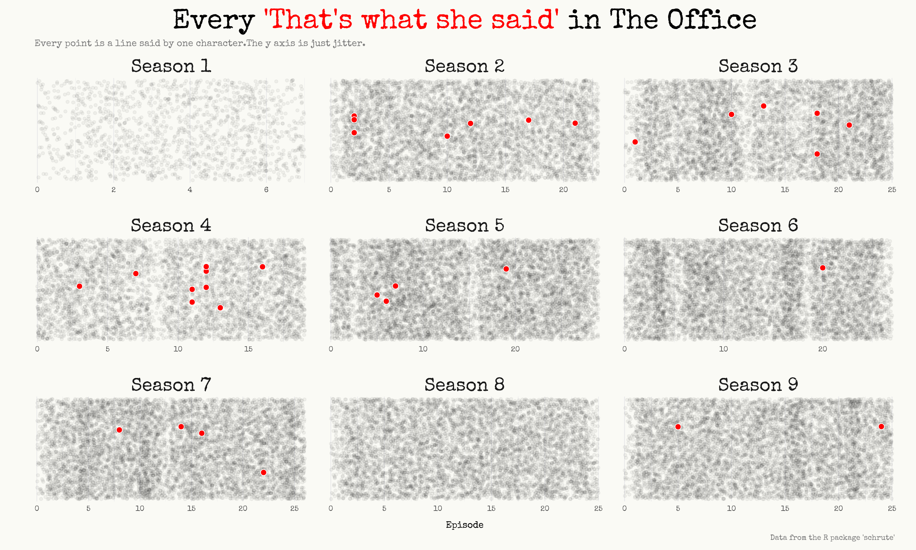
I think I’m quite pleased with the result.