Portfolio
A glimpse of some data visualizations I’ve realized both for work and for personal fun (often participating in challenges like #TidyTuesday and #MakeoverMonday).
When the title reports that the chart is interactive, you can click on it and check the interactive version on my Tableau Public’s profile. Clicks on non-interactive charts will open an high-quality version of these charts. So, in any case click 😉
Most of these charts are in italian (my native language): if you’re not an italian speaker, I’m really sorry about that. I’m already working on uploading more charts in english.
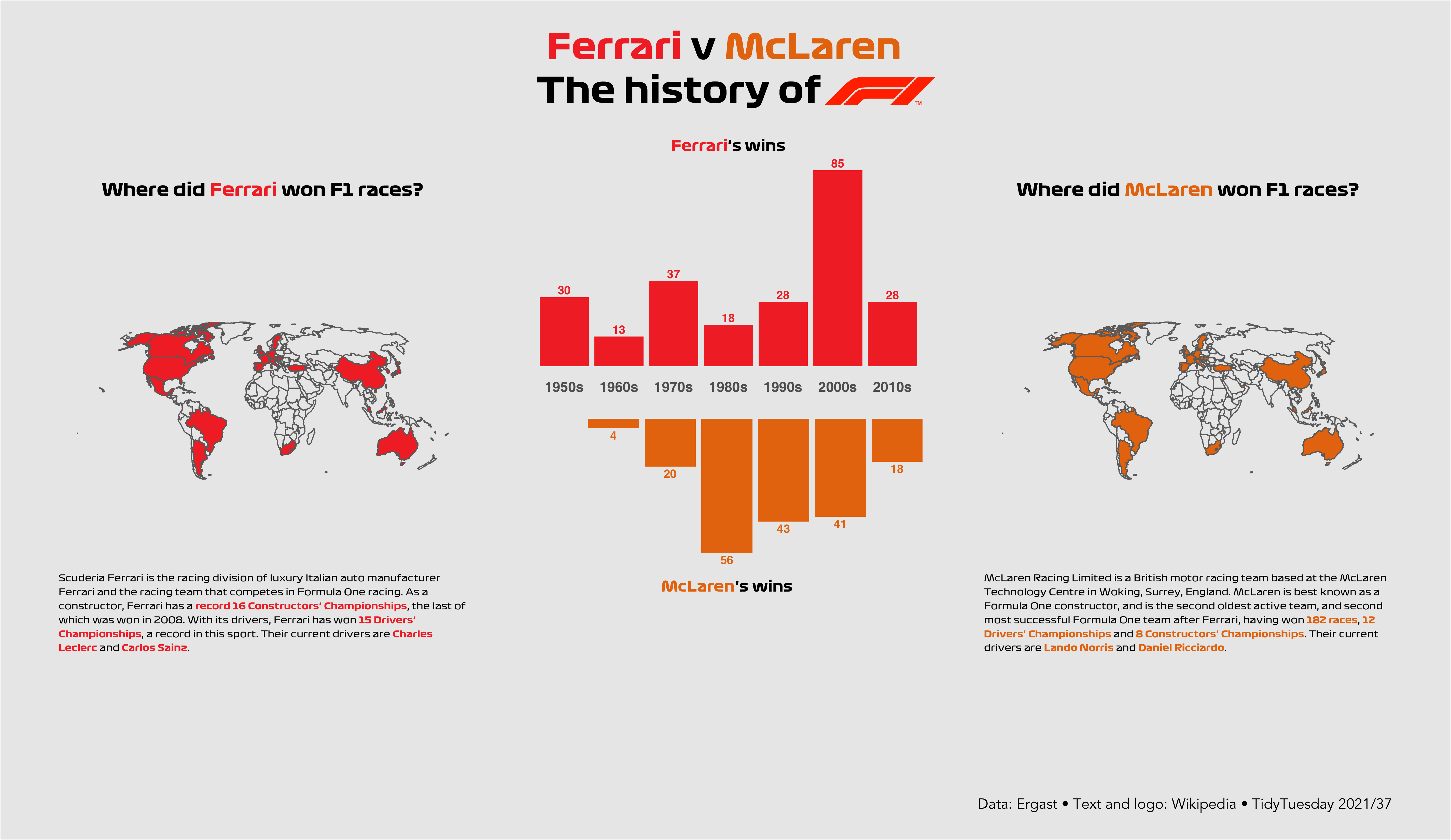
TidyTuesday 2021/37 (code) 🏎 Formula 1 Races by Ergast
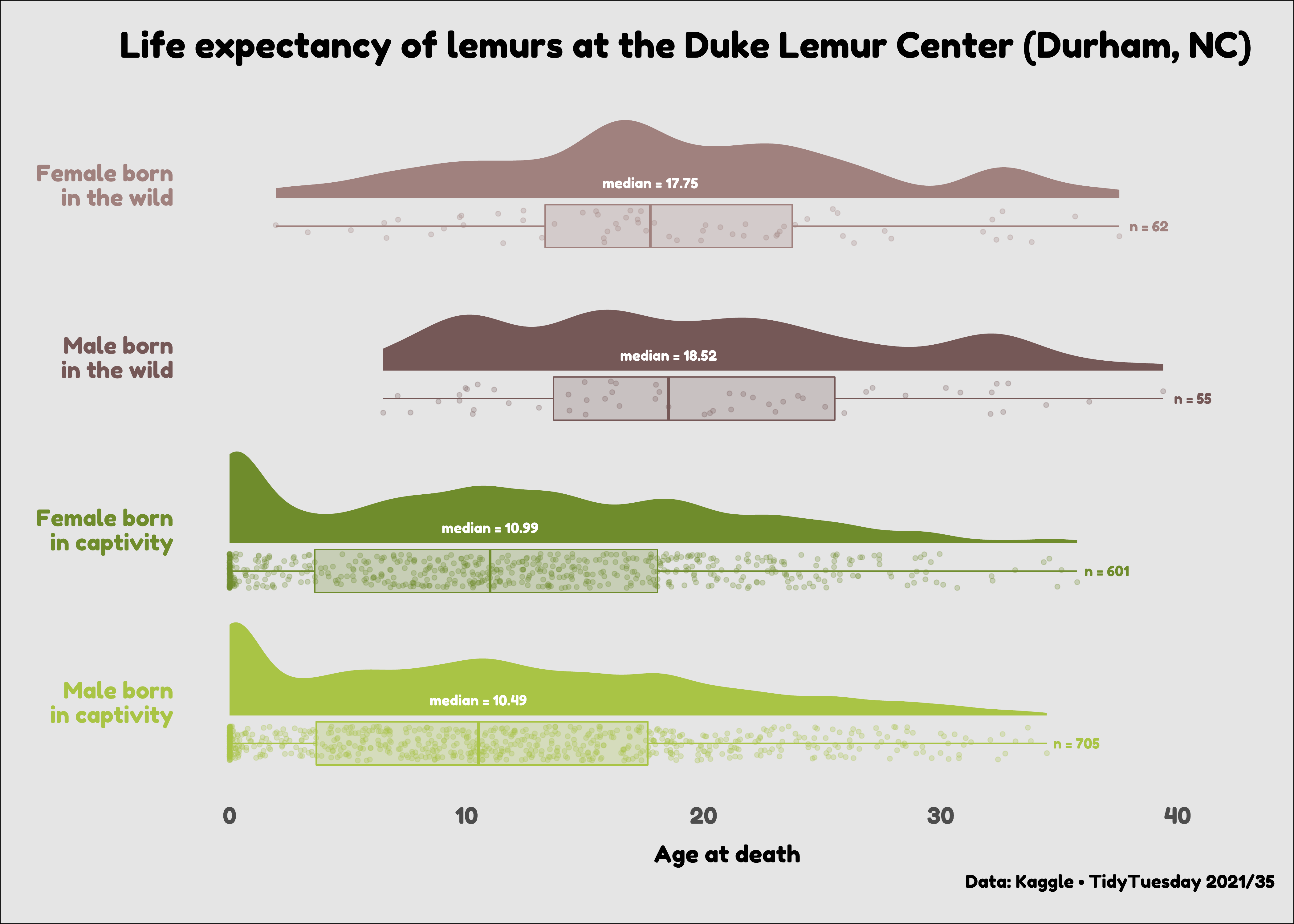
TidyTuesday 2021/35 (code) 🐒 Lemurs by Kaggle
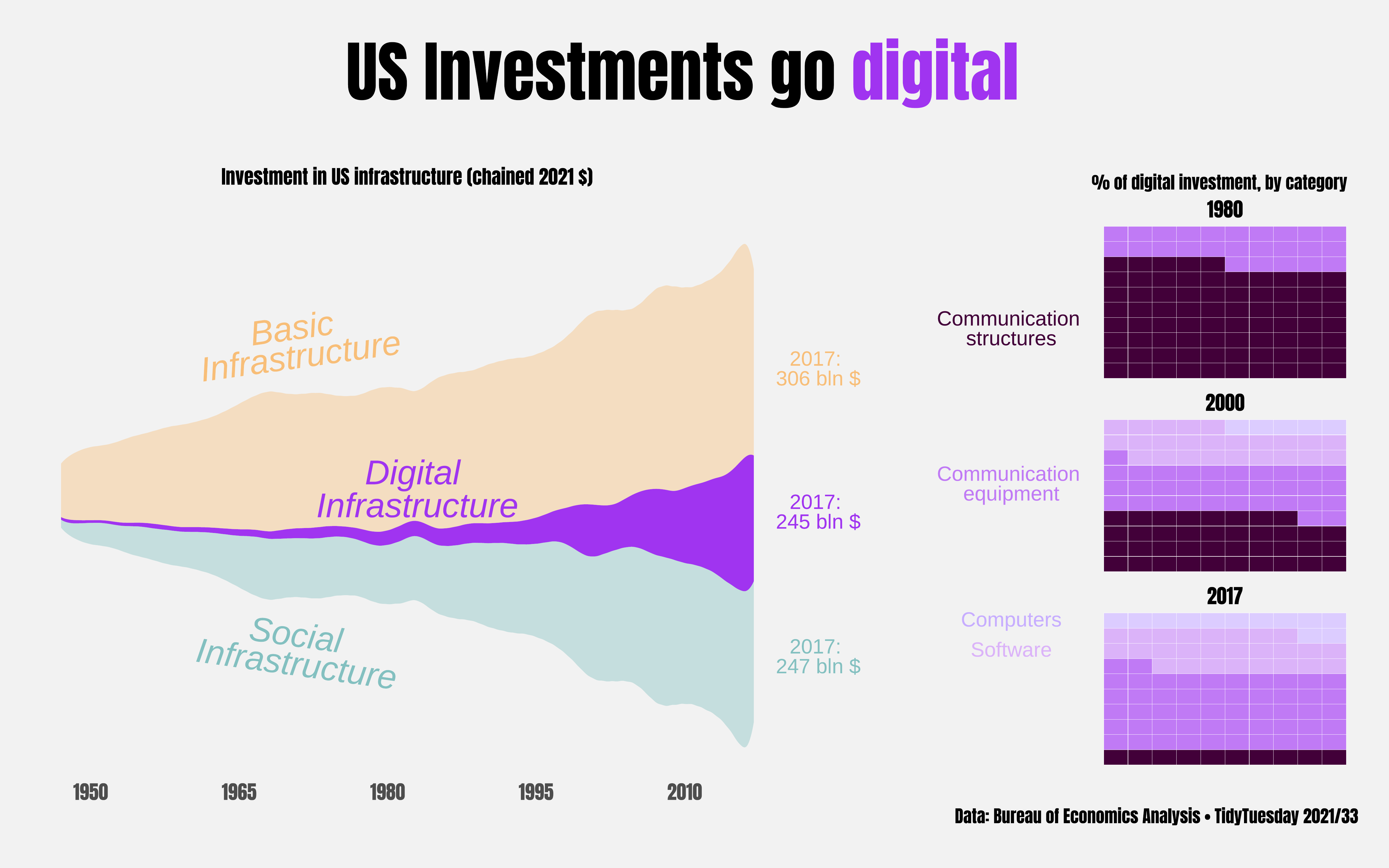
TidyTuesday 2021/33 (code) 💵 BEA Infrastructure Investments by BEA
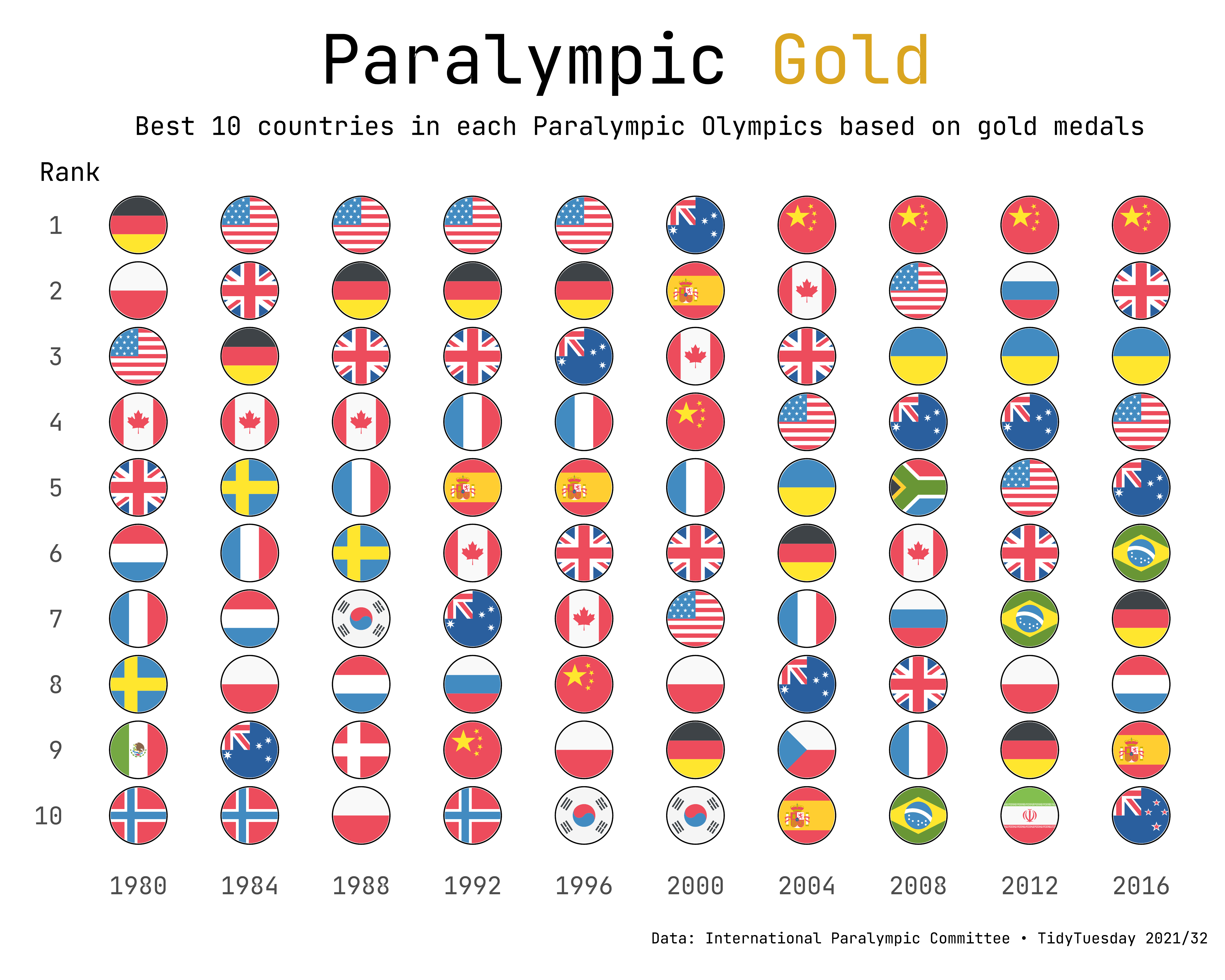
TidyTuesday 2021/32 (code) 🏅 Paralympics Medals by IPC
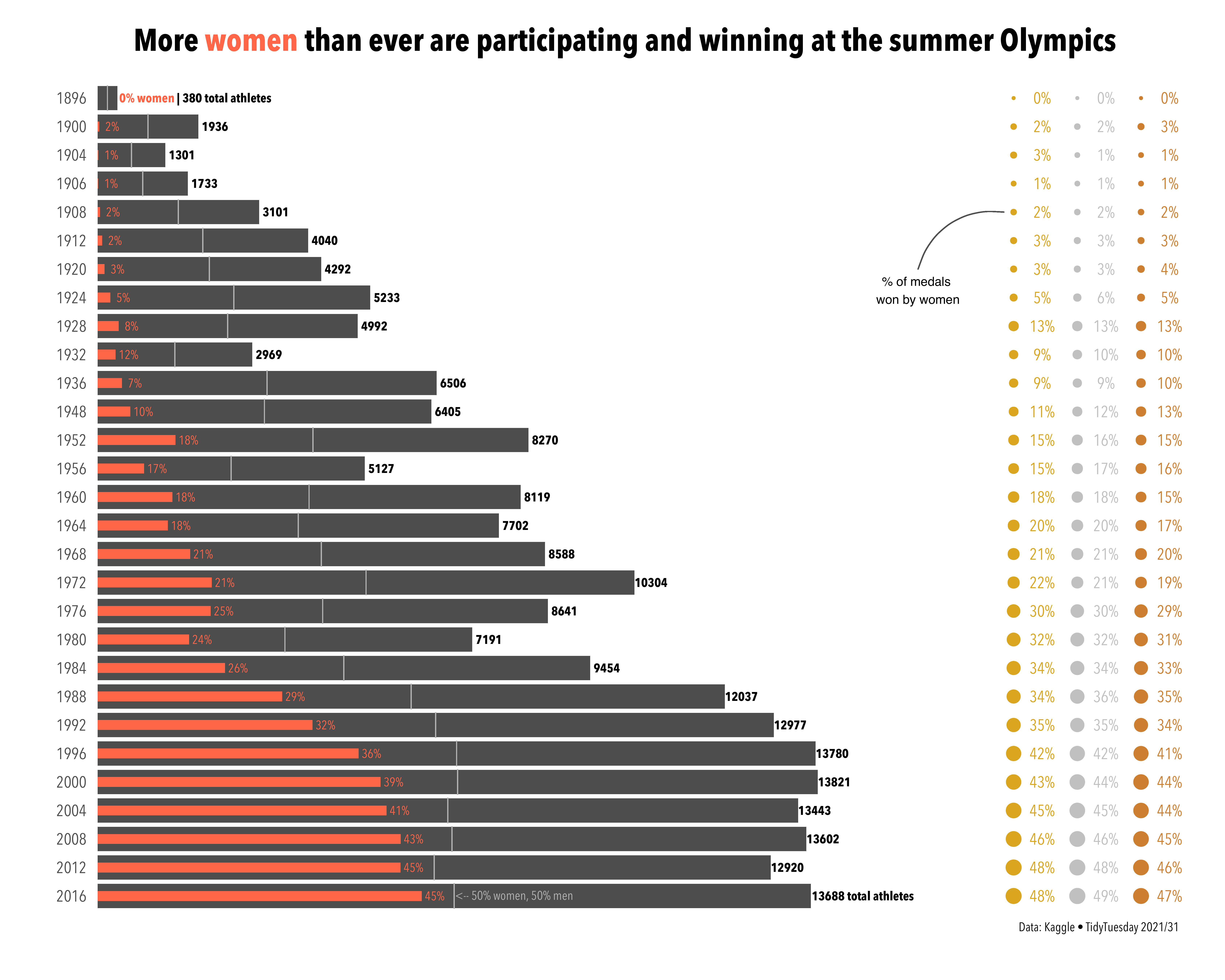
TidyTuesday 2021/31 (code) 🏅 Olympics Medals by Kaggle (original code for the left chart: Cédric Sherer)
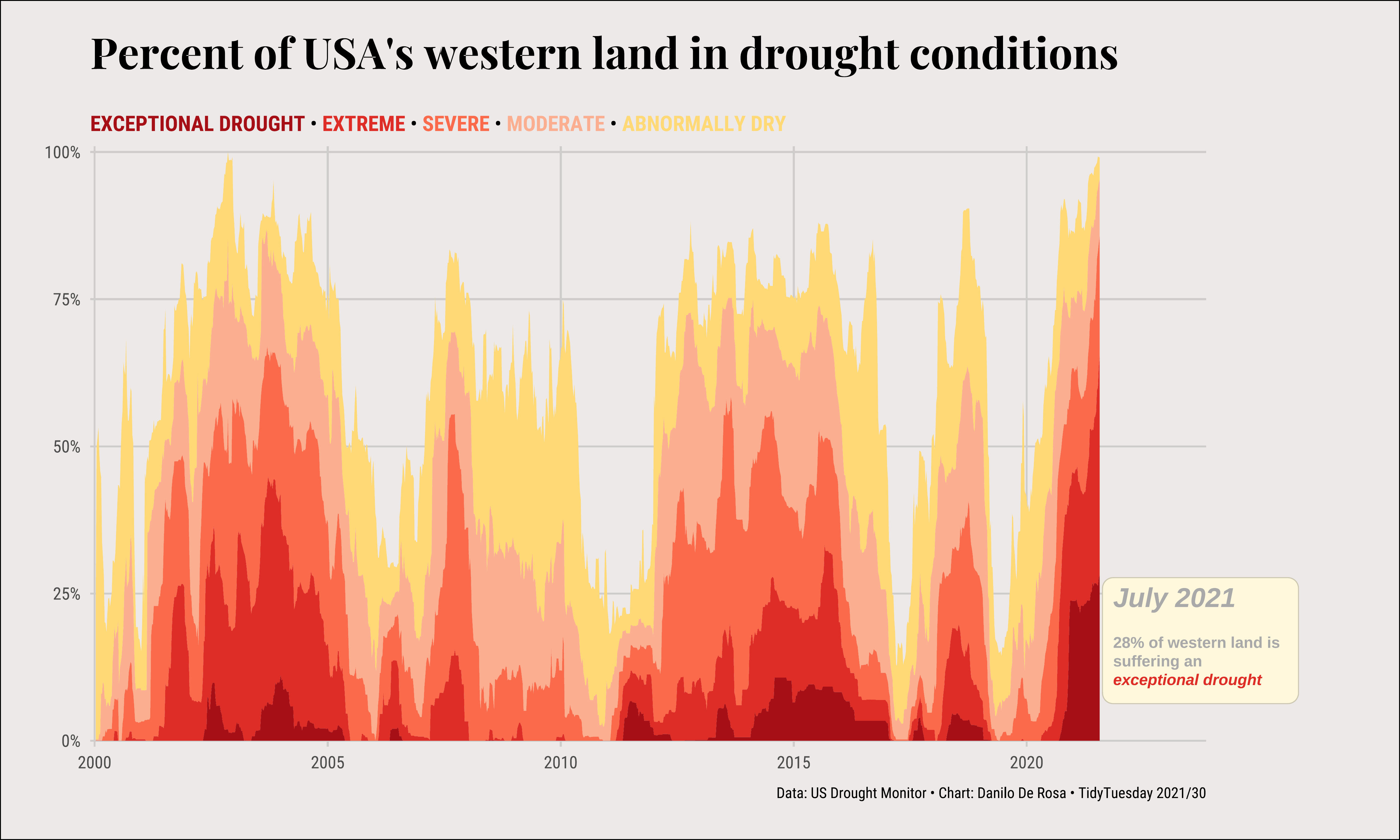
TidyTuesday 2021/30 (code) 👩🚒 US Droughts by Drought Monitor
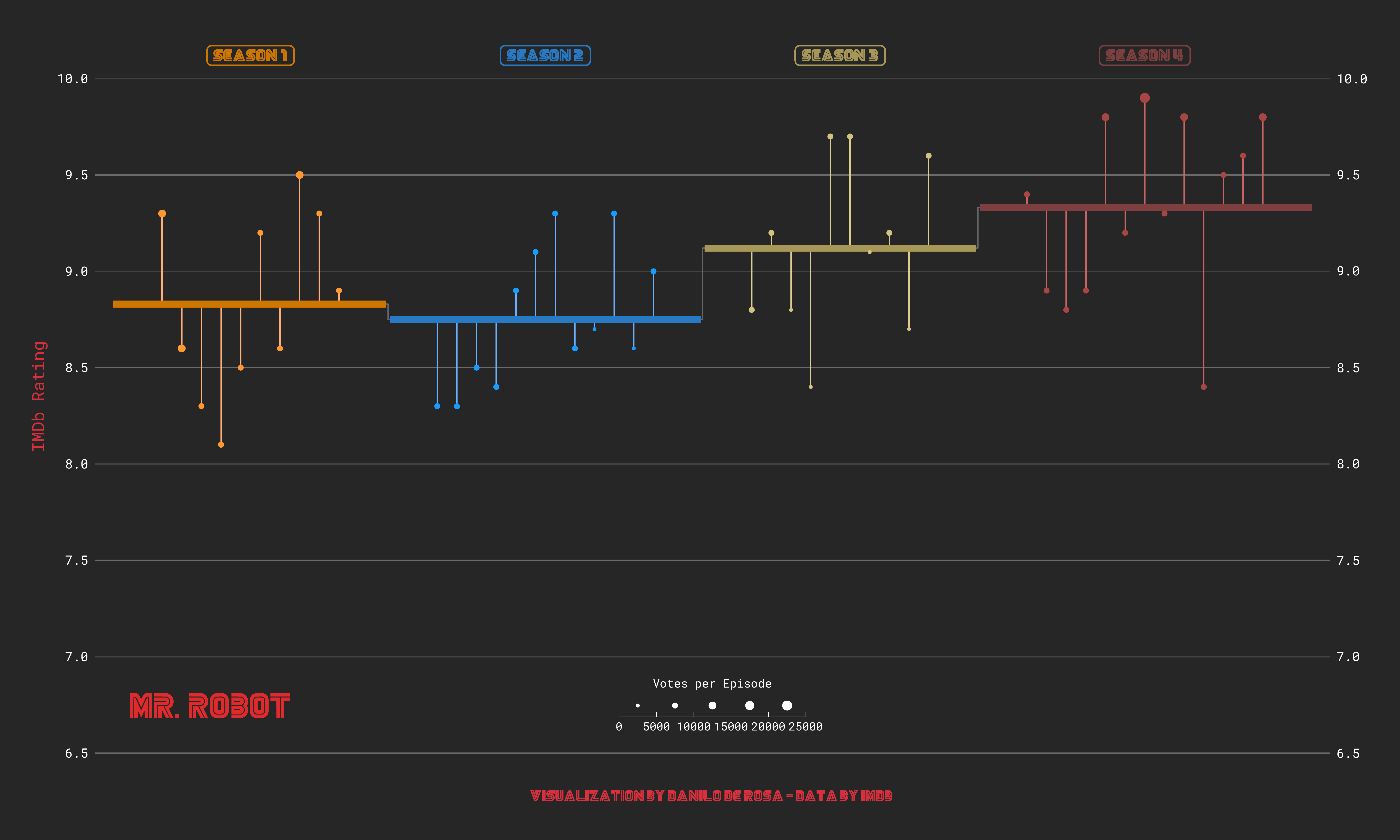
Mr Robot ratings on IMDB (heavily inspired by Cédric Sherer)
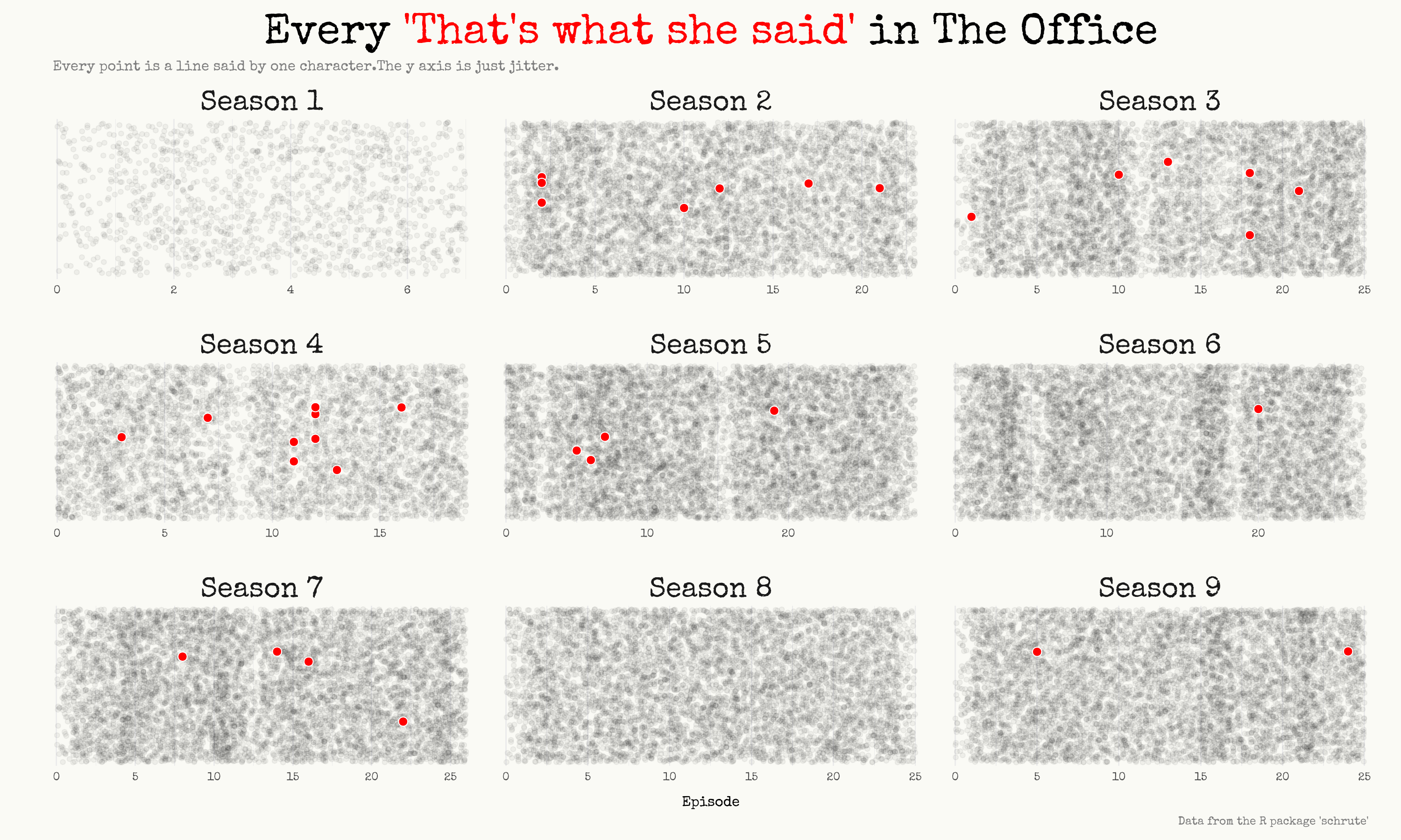
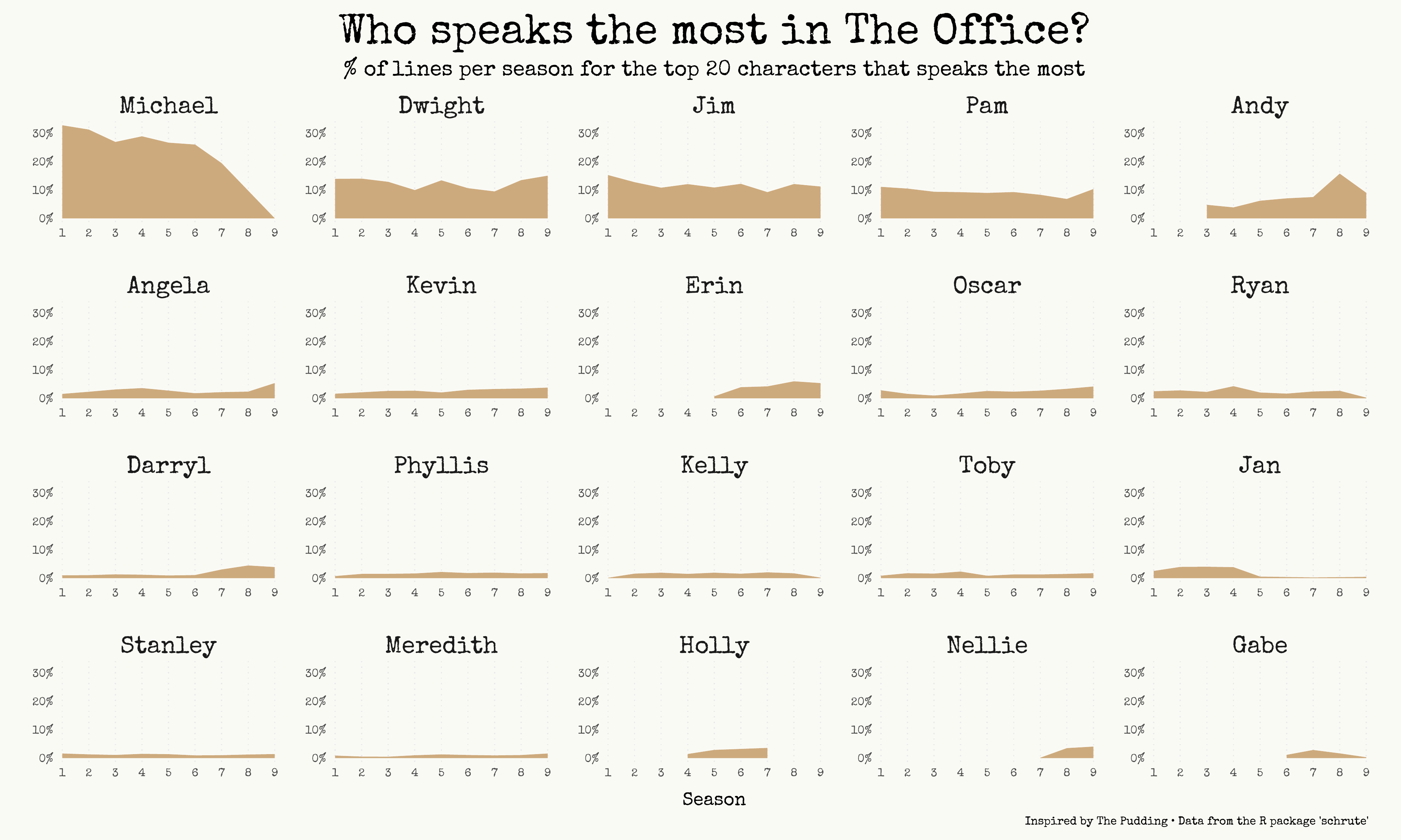
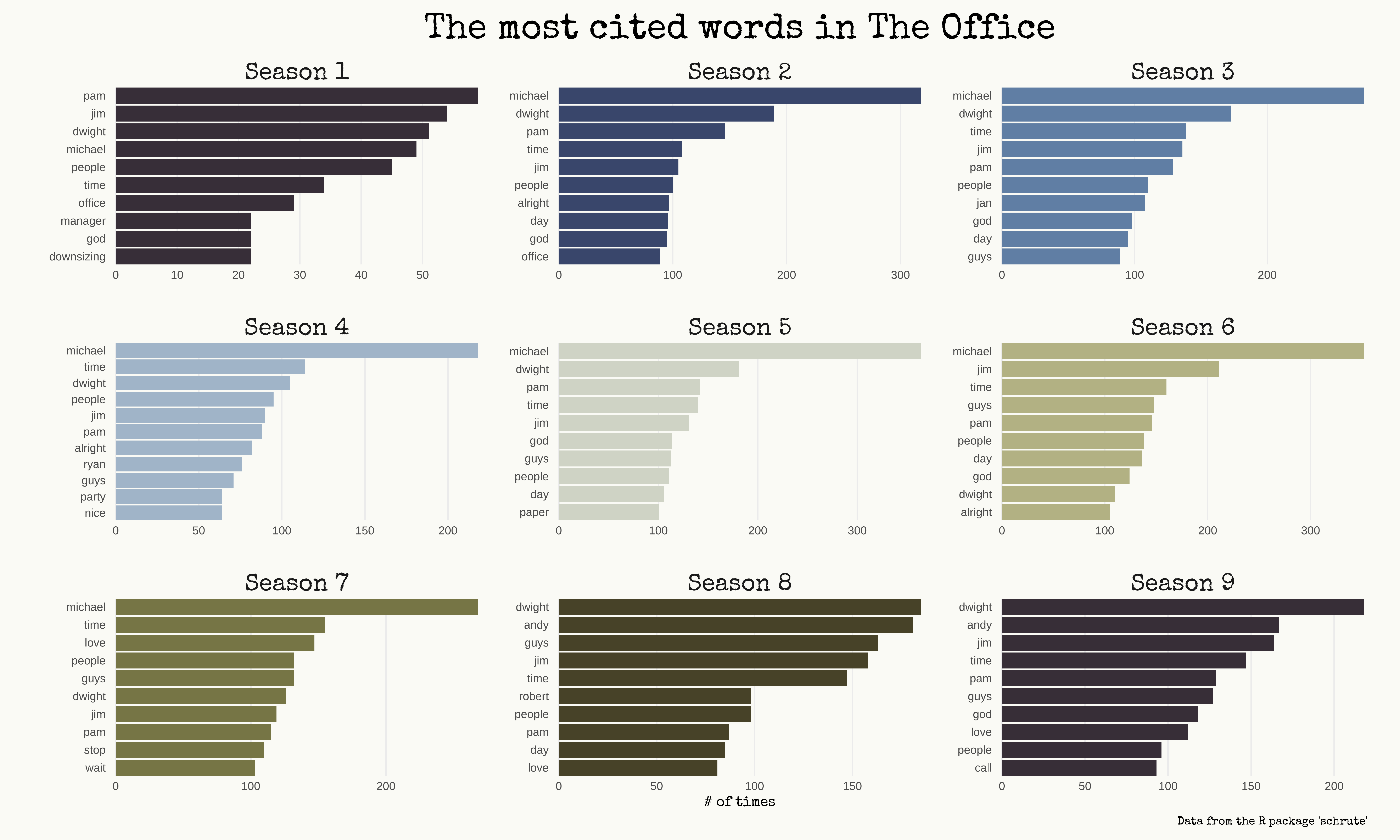
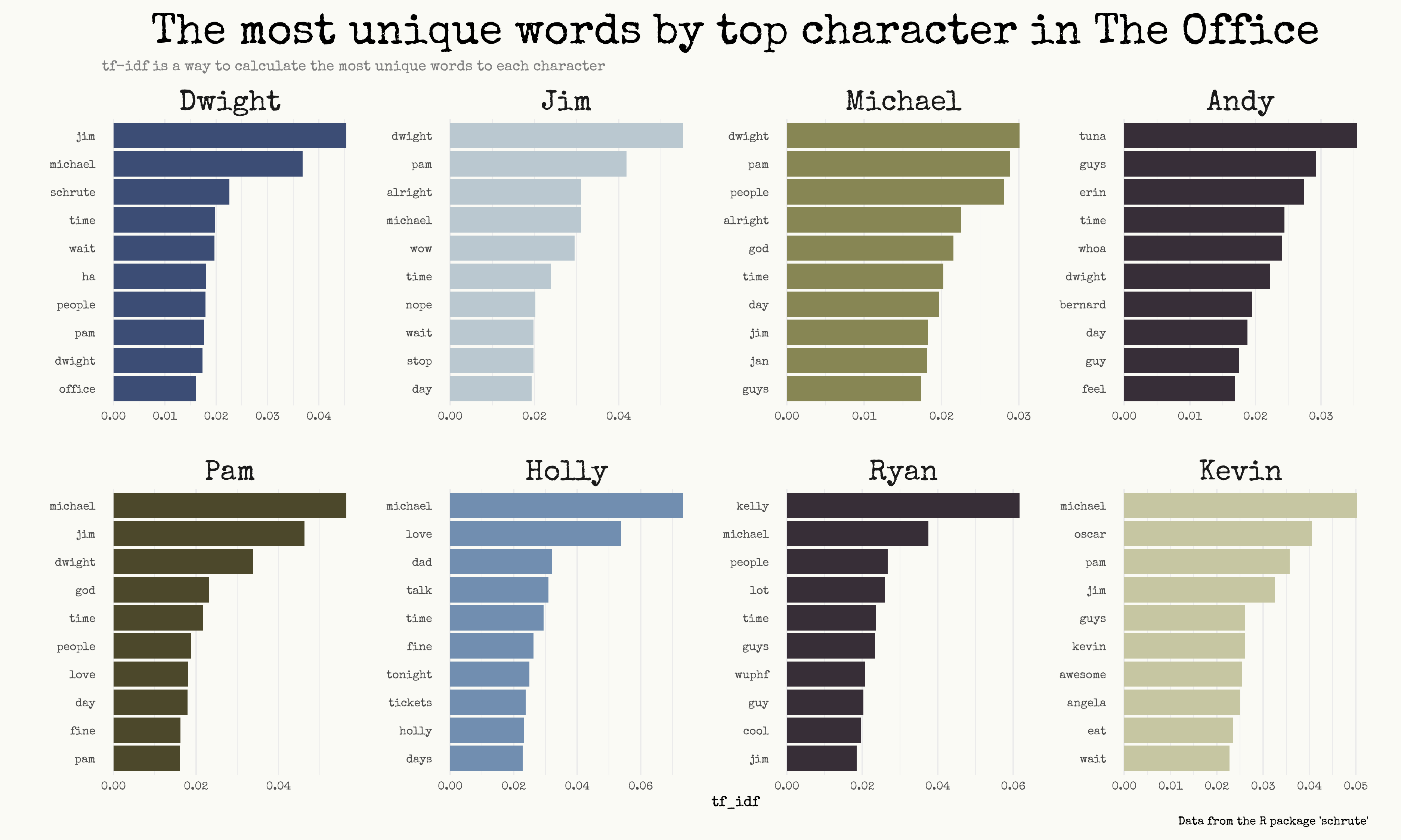
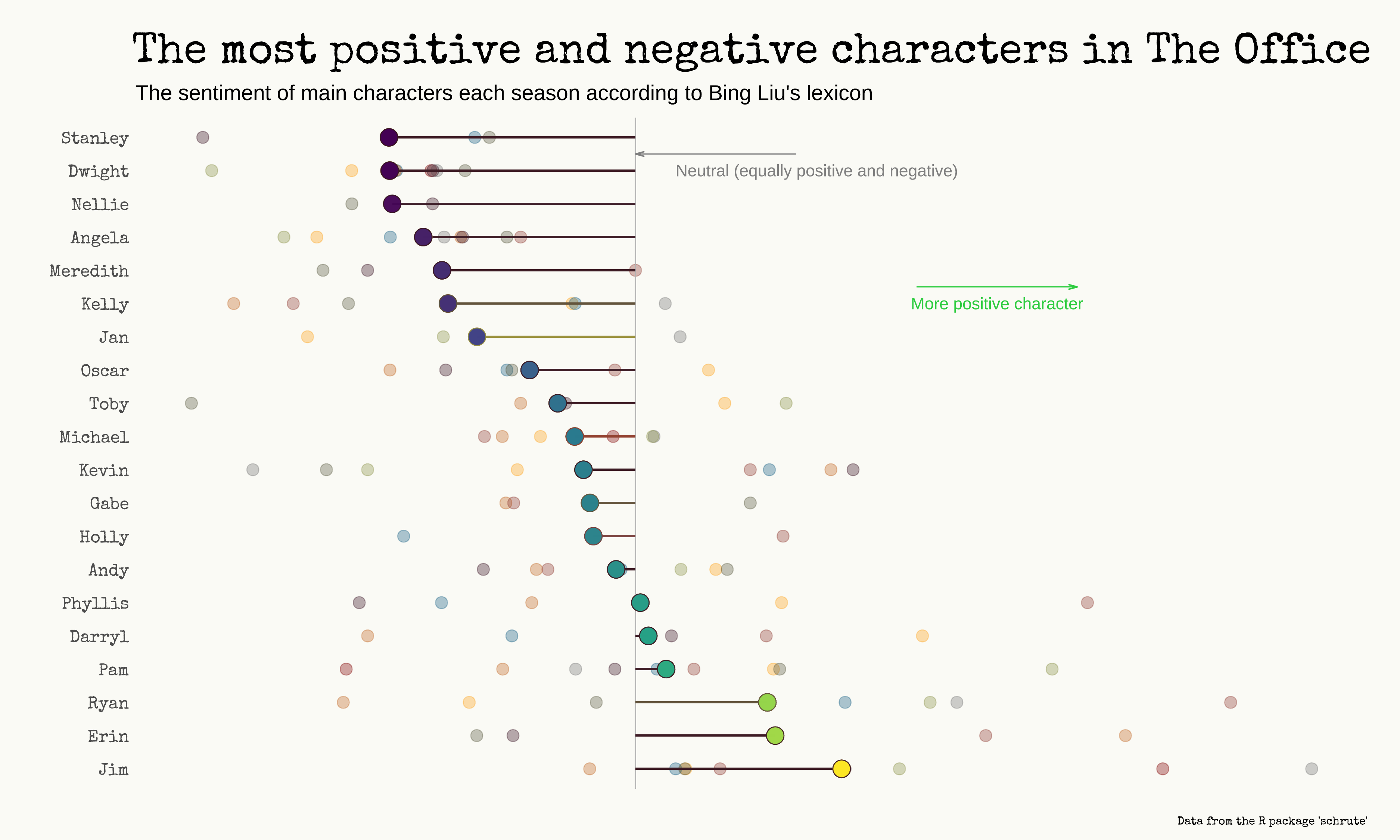
Analyzing The Office’s dialogues (blog post here)
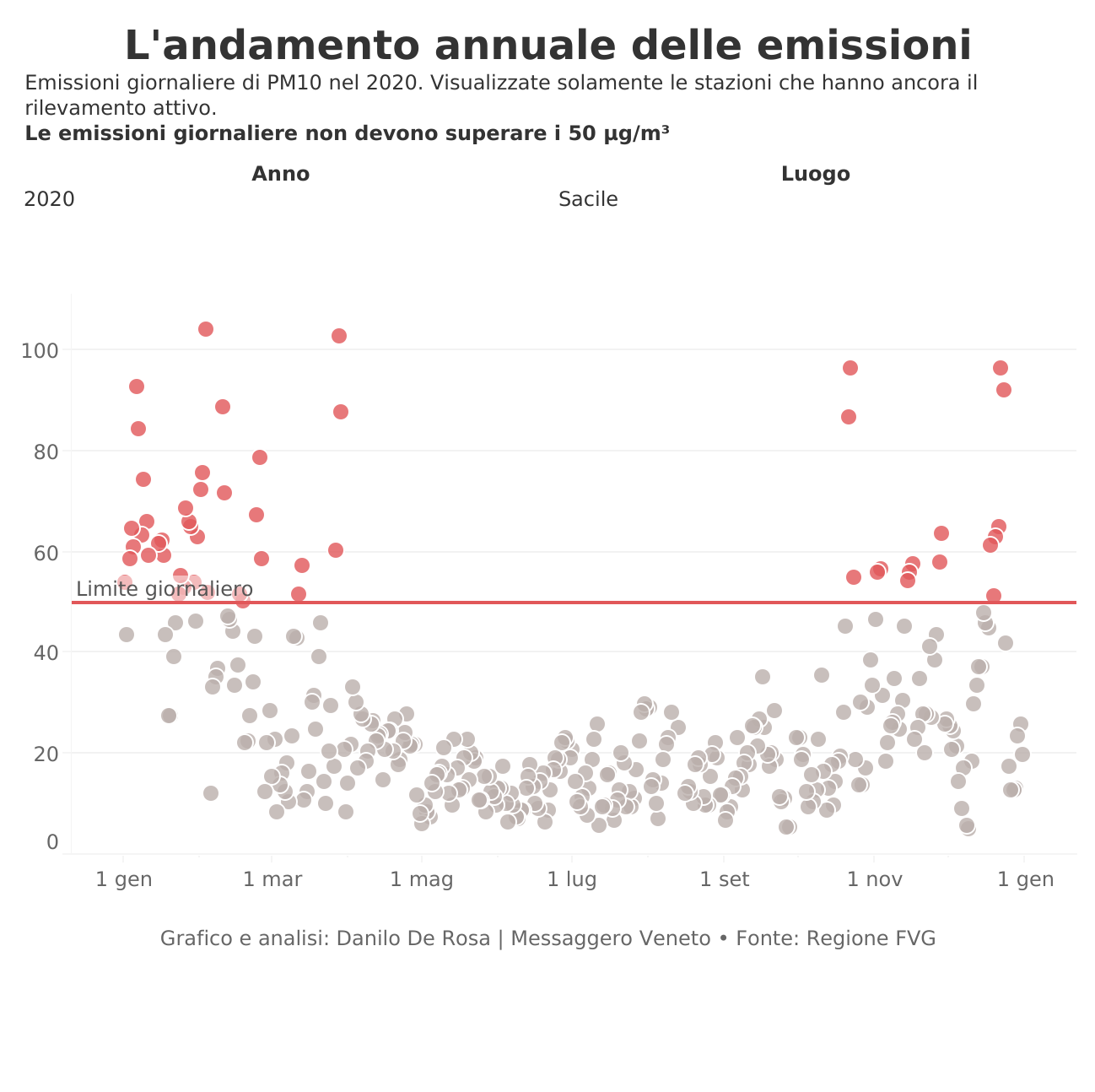
Emissions of PM10 during 2020 in Friuli-Venezia Giulia (interactive)
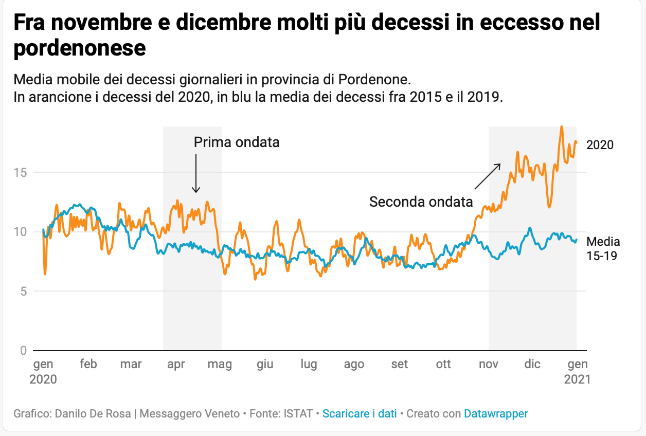
Excess deaths during November and December 2020 in the province of Pordenone
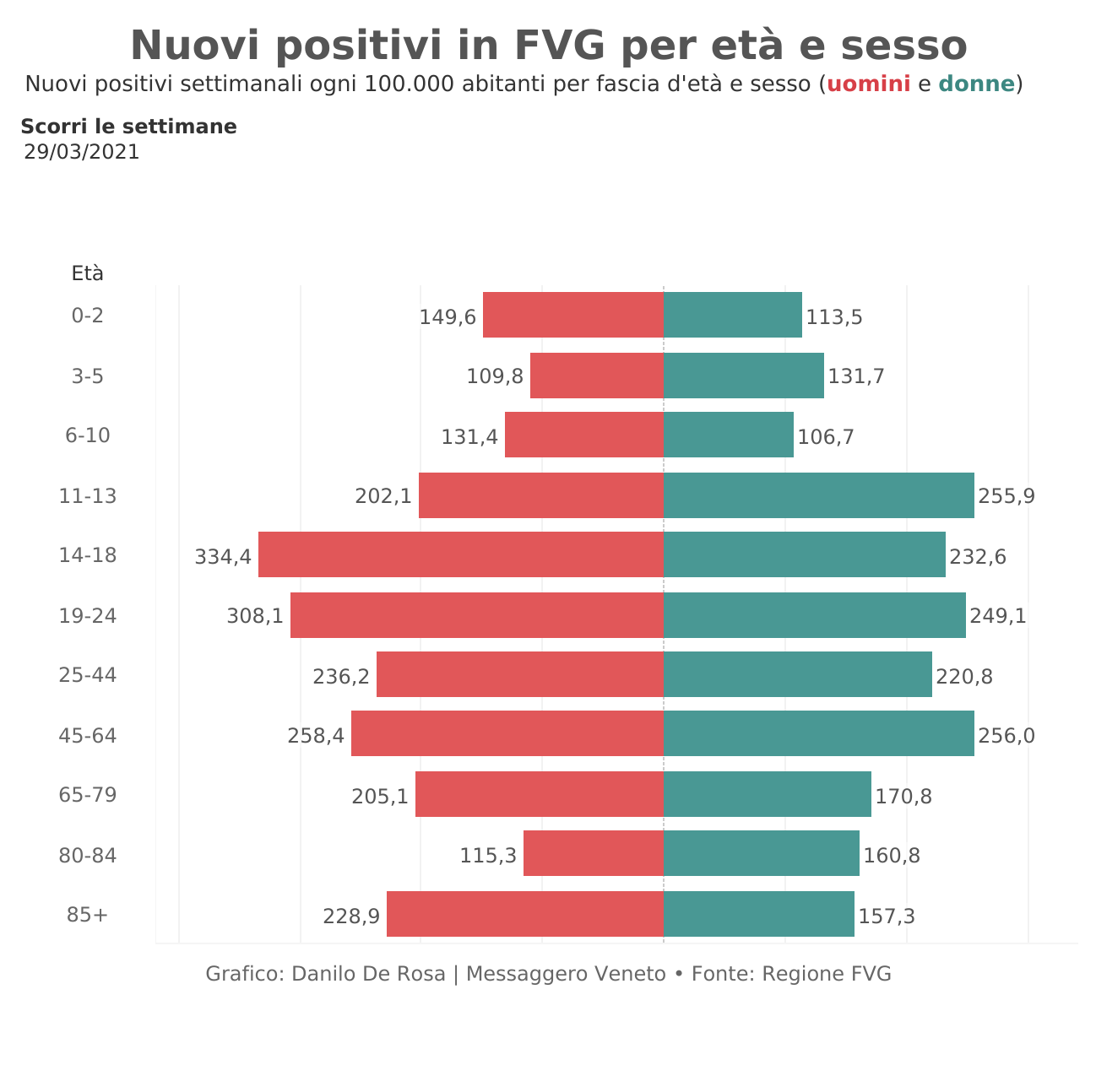
New Covid-19 cases in Friuli-Venezia Giulia based on gender and age
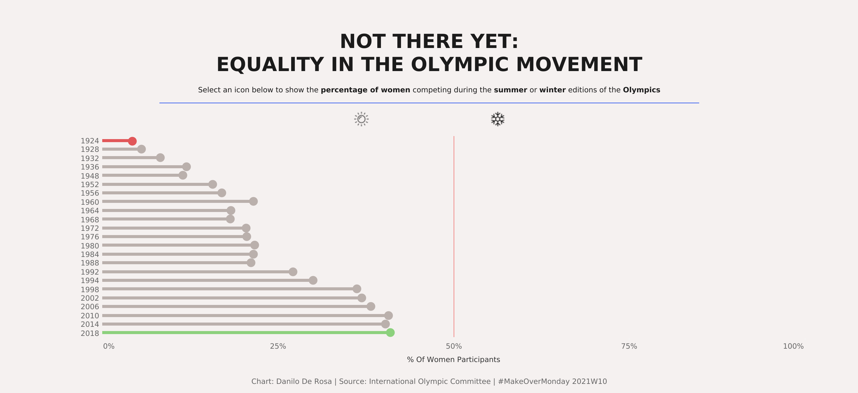
Equality in the Olympic movement (interactive)
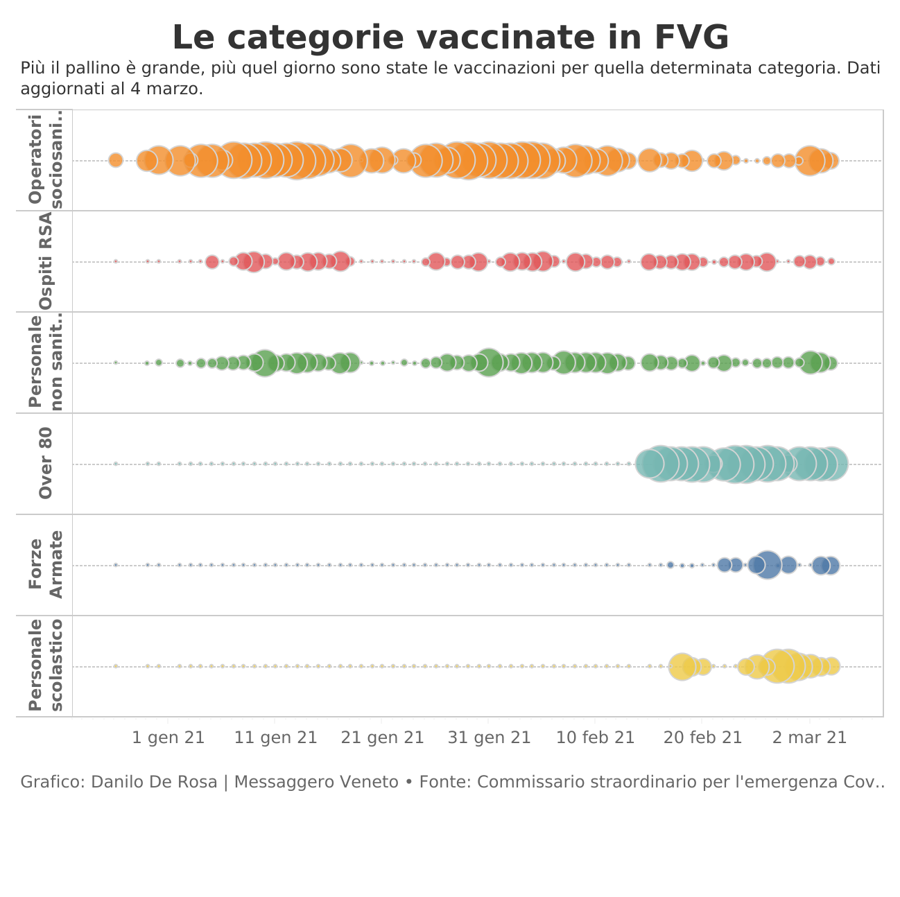
Vaccines doses in Friuli-Venezia Giulia subdivided on specific categories
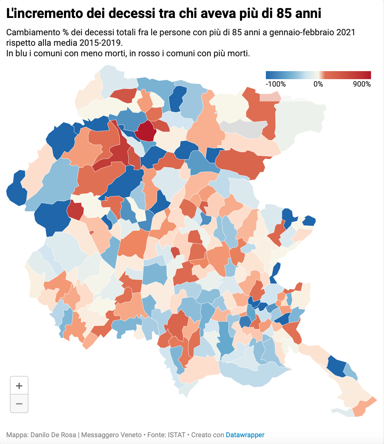
Excess deaths in people aged over 85 in Friuli-Venezia Giulia (Jan-Feb 2021, interactive)
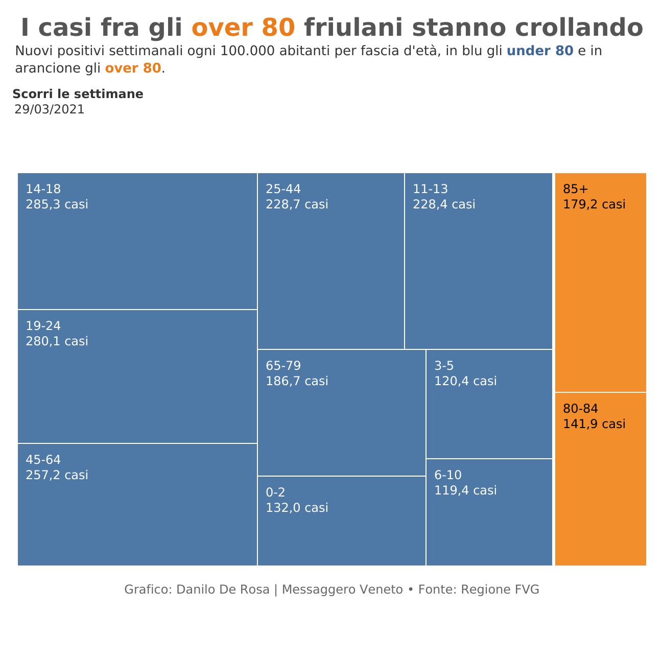
Covid-19 cases in Friuli-Venezia Giulia’s older people plummeted after the vaccination campaign
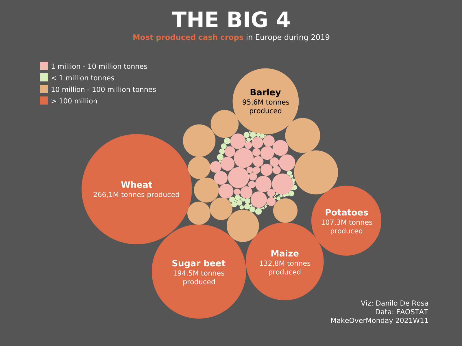
Most produced crops in Europe during 2019
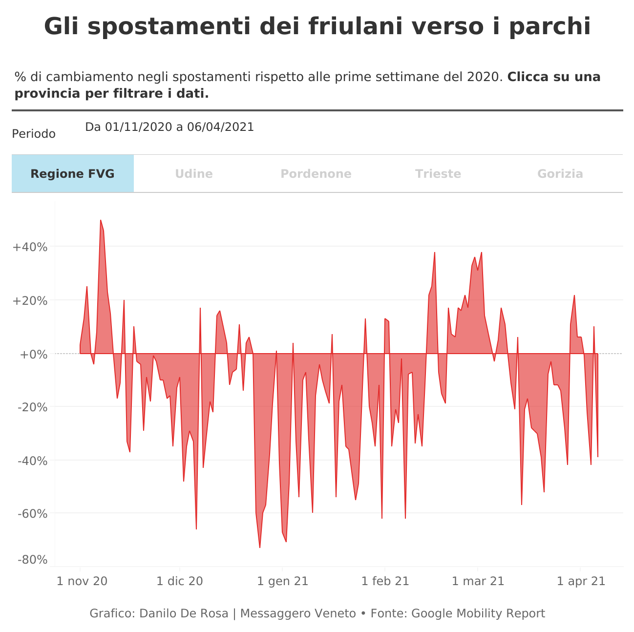
Movement towards parks in Friuli-Venezia Giulia during 2020-2021 (interactive)
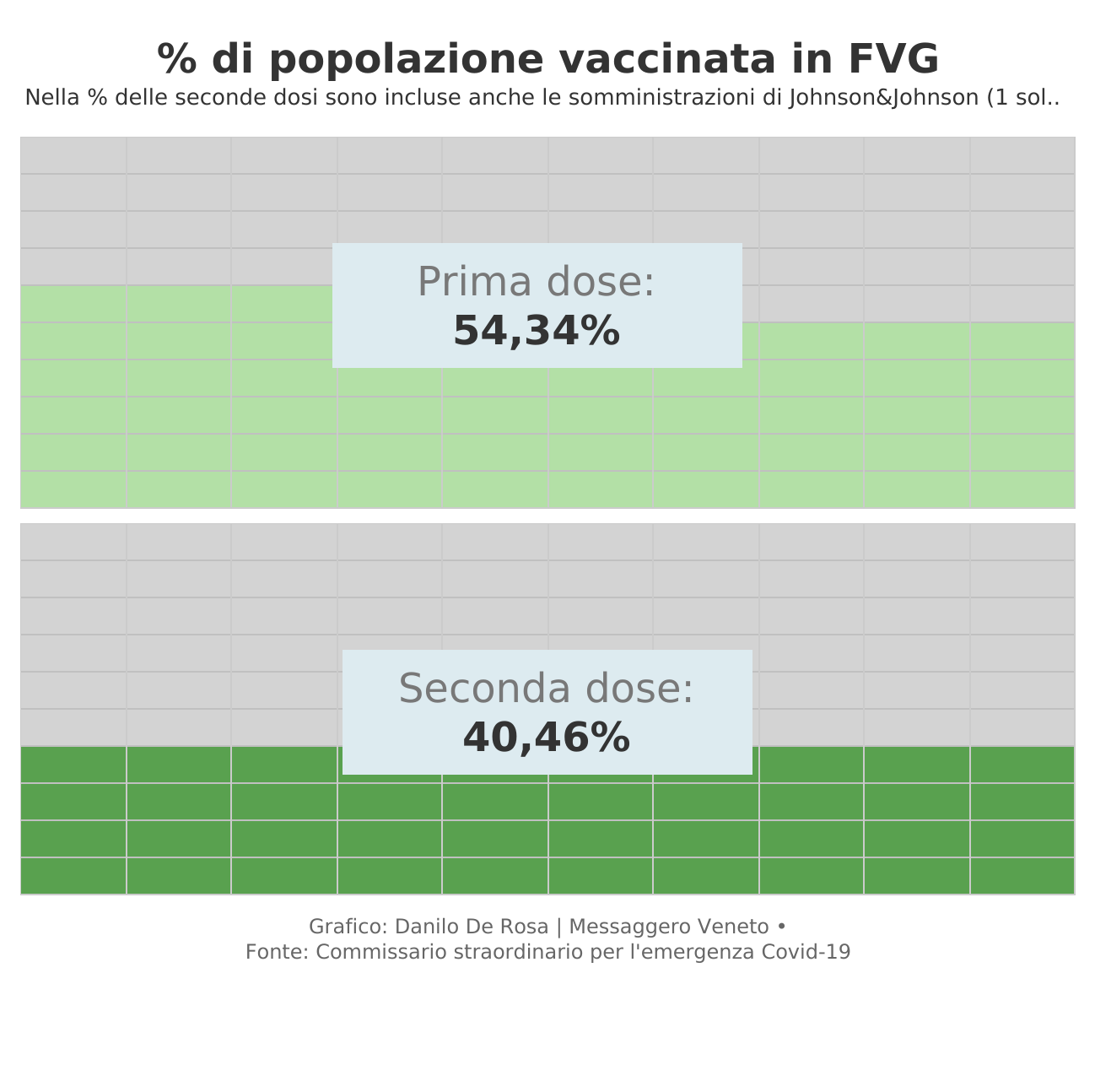
% of vaccinated in Friuli-Venezia Giulia (July 2021)